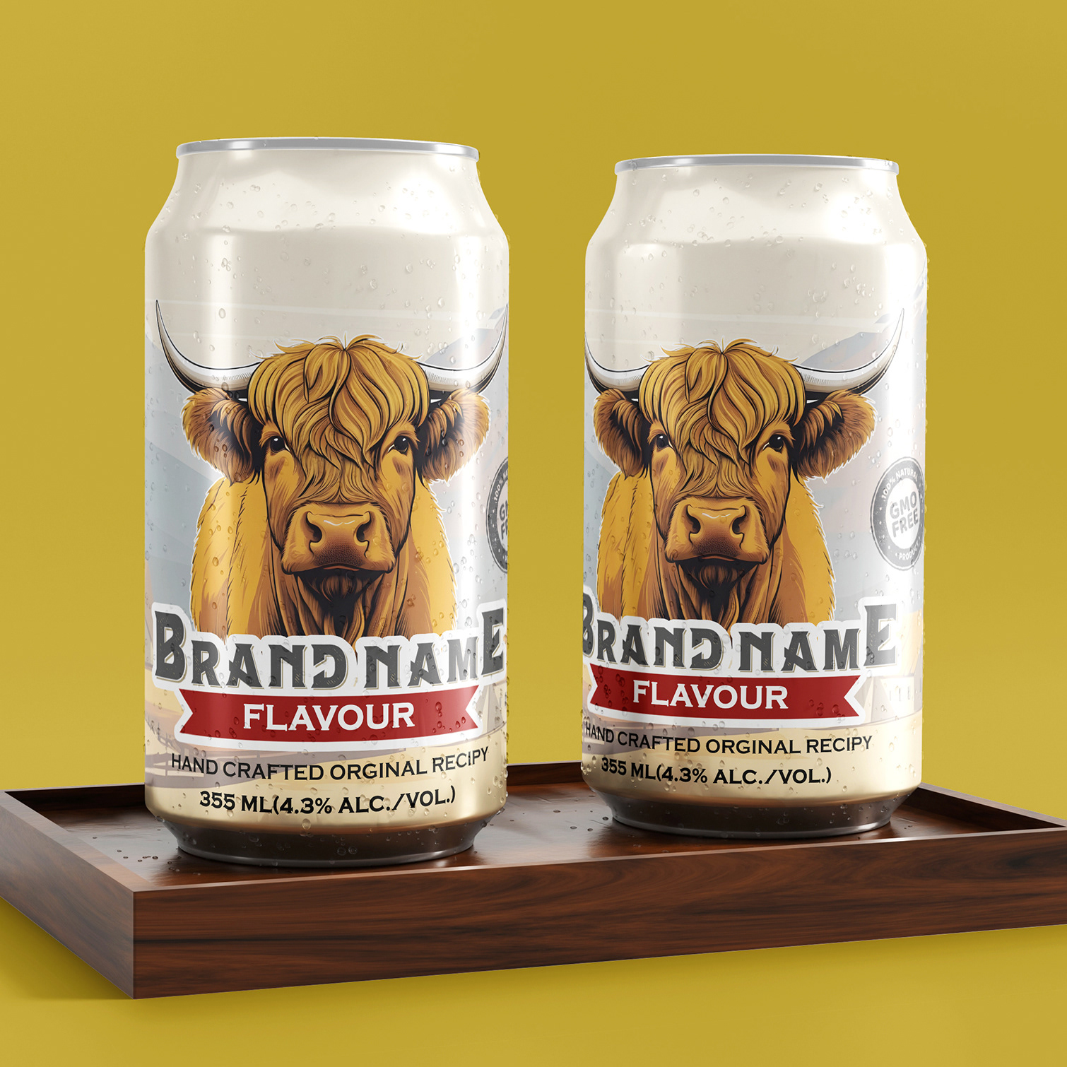
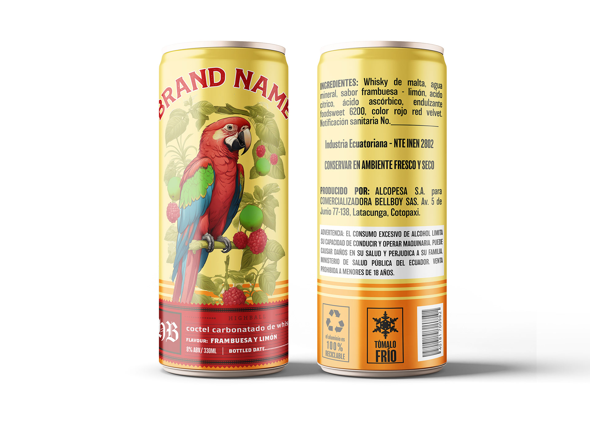
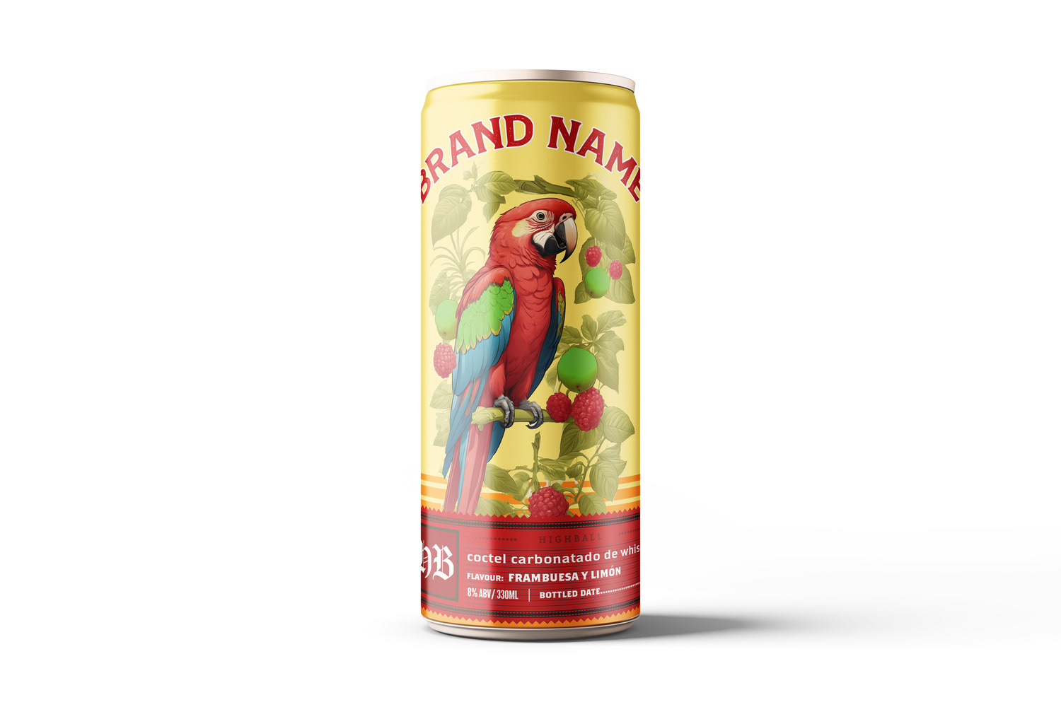
Execution of Design Principles: The Cocktail label design exemplifies a vibrant and natural theme through the use of a bold color palette, dynamic typography, and detailed botanical illustrations. Each design element is carefully curated to create a lively and cohesive look. The strategic use of contrasting colors and organic shapes not only captures attention but also conveys the freshness and natural ingredients of the product.
Conceptual Thought: The conceptual foundation of the Cocktail label design centers around the invigorating and refreshing qualities of nature. By integrating bright, vivid colors and intricate botanical motifs, the design evokes the essence of a fresh, natural beverage. The imagery and design choices are intended to create an immediate connection with consumers, suggesting a product that is both healthy and full of life. This concept is further reinforced by the tactile feel of the design, which invites consumers to experience the product’s natural vitality.
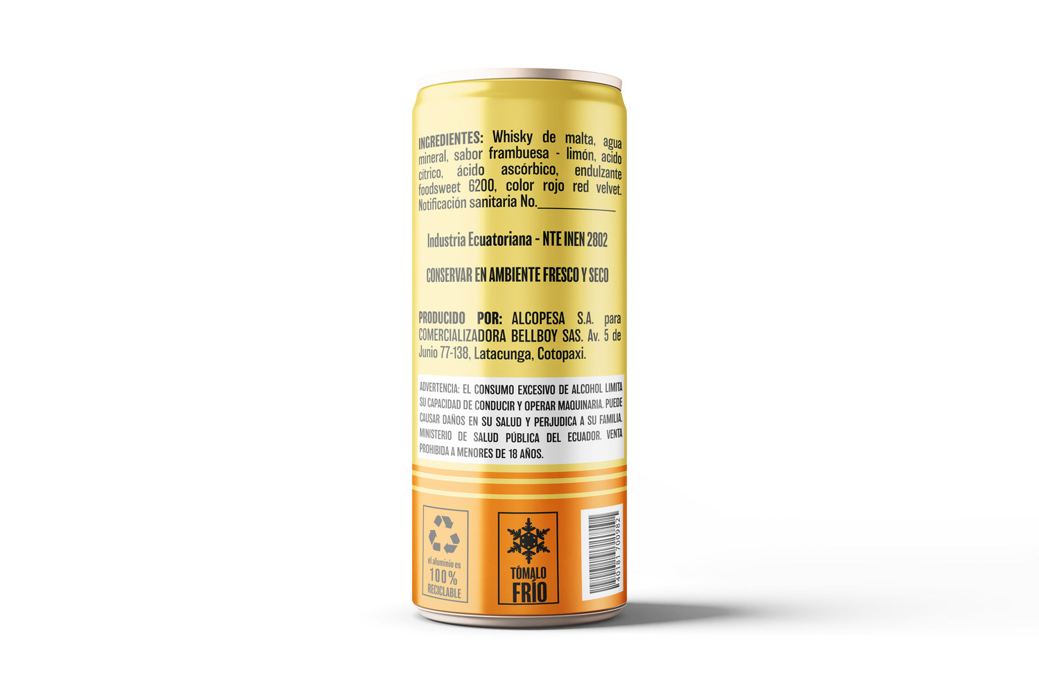
Technical Skills and Deliverables: Utilizing industry-leading design software, I meticulously crafted high-resolution, print-ready files tailored specifically for tin can packaging. The technical execution involved precise color management to ensure vibrant hues and sharp details in the final print. Additionally, the design was optimized for durability, ensuring that the label maintains its visual appeal despite the rigors of handling and storage. Deliverables included comprehensive printing guidelines and specifications, ensuring consistency and high quality across all production batches.
Client Communication and Satisfaction: Throughout the project, maintaining open and effective communication with the client was paramount. Regular updates, detailed progress reports, and collaborative feedback sessions ensured that the design process was aligned with Cocktail’s brand vision and objectives. By actively engaging the client at every stage, I was able to incorporate their feedback and exceed their expectations, delivering a final design that enhances the product’s market presence and consumer appeal. The successful collaboration resulted in a label that not only met the client's needs but also positioned the product competitively in the market.